Chart Types
Lookout supports a variety of charts to display your data. Each chart is interactive and can be used to filter data shown on the site.
This reference illustrates the various chart types that can be used in layout.json and their configurations.
| Chart Type | kind | Required Fields |
|---|---|---|
| Case Chart | "disease" | kind, field |
| Positivity Series | "positivityseries" | kind, field |
| Choropleth Map | "map" | kind, field, uri |
| Map Readout | "map-readout" | kind, field |
| Shelf | "shelf" | kind, field |
| Tiny Donut | "tinydonut" | kind, field |
| Telescope | "telescopebars" | kind, field |
| Histogram | "histogram" | kind, field |
| Record Table | "record-table" | kind, fields |
| Text Analysis | "text-leaderboard" | kind, field |
| Phylogenetic Tree | "tree" | kind, uri, nwk_delimiter, nwk_id_pos, root_date, timeTickInterval |
| Gauge | "gauge" | kind, field |
Case Chart
Shows test results over time, broken down by test type if available.
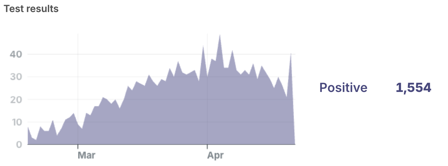
"my-case-chart": {
  "kind": "disease",
  "field": "disease-a",  // or another pathogen
}
Setting up alerts on case charts
You can optionally set alert thresholds for any case chart. (We mainly recommend this on a multi-pathogen view.) If the case count exceeds the threshold, Lookout will highlight the chart.
To trigger different alerts based on severity, you can assign a “level one” threshold and a “level two” threshold.
intervalsInWindow: The number of consecutive bars (dataIntervals) to average when checking whether an alert is needed.intervalsInWindow: 1will trigger an alert if any single bar exceeds the threshold, whereasintervalsInWindow: 4will trigger an alert if the average cases over four bars exceeds the threshold.warningThreshold: The case count threshold that will trigger the first level of alert. (Set to the same asalarmThresholdto effectively skip this threshold.)alarmThreshold: The case count threshold that will trigger the second level of alert.
Example
"my-case-chart": {
  "kind": "disease",
  "field": "disease-a",
  "alert": {
    "intervalsInWindow": 1, // Check whether single bar exceeds threshold
    "warningThreshold": 100,
    "alarmThreshold": 150, // Level 1 alert triggered at 100 cases, Level 2 at 150
  }
}
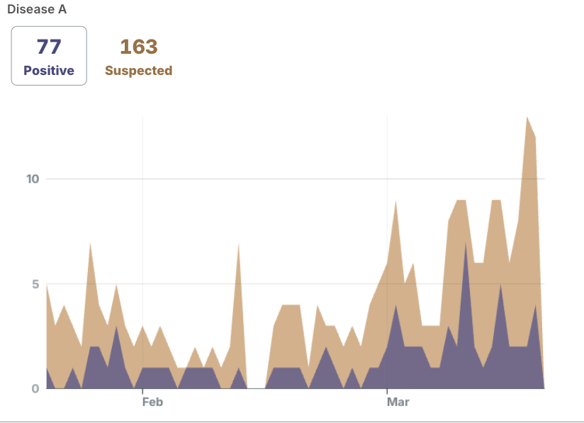
No alarm
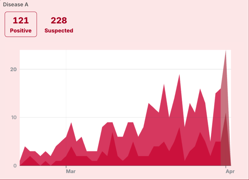
Alarm level 1
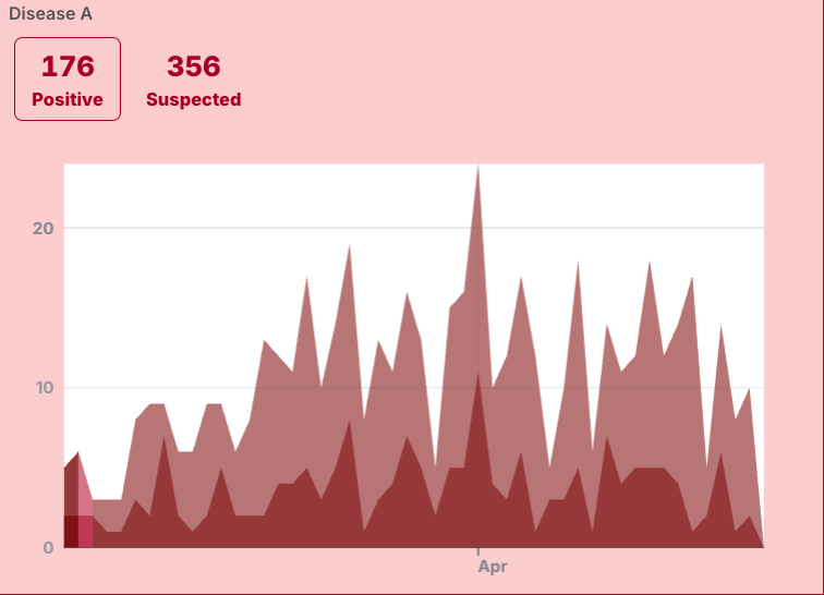
Alarm level 2
Positivity series
Shows test positivity rate over time.
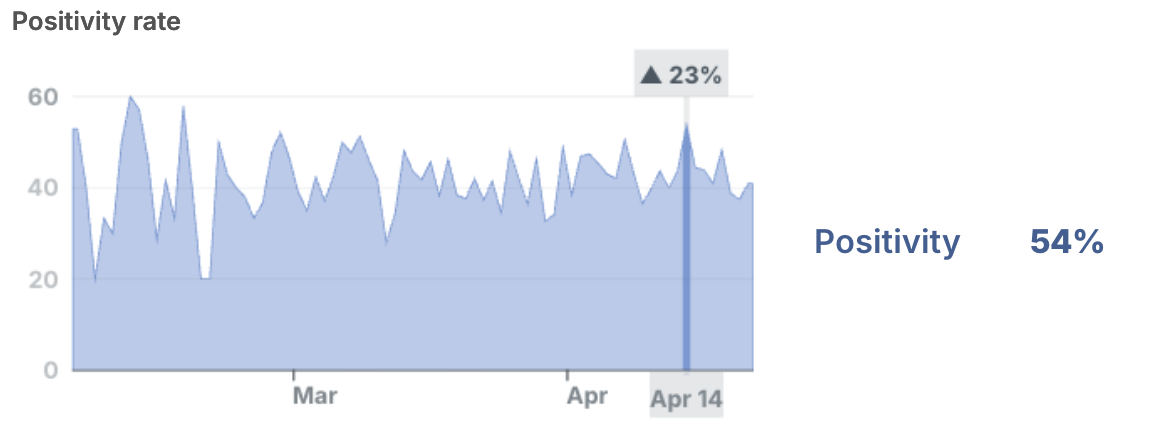
"my-positivity-series": {
  "kind": "positivityseries",
  "field": "disease-a",
}
Choropleth map
Shows case density by color intensity. Users can explore the geographic spread of pathogens and filter down to specific geographic entities.
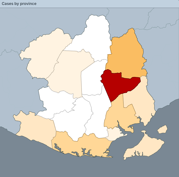
"my-map": {
  "kind": "map",
  "label": "Cases by province",
  "field": "geo", // Field for geographic data in records.json
  "uri": "nation.svg", // Path to map svg in site folder
  }
To set up your SVG for your map view, see Displaying Maps.
Map readout
List representation of a choropleth map.
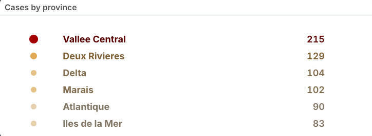
"my-map-readout": {
  "kind": "map-readout",
  "field": "province"
}
Shelf
Shows values by count in descending order. Ideal for fields with a many unique values.
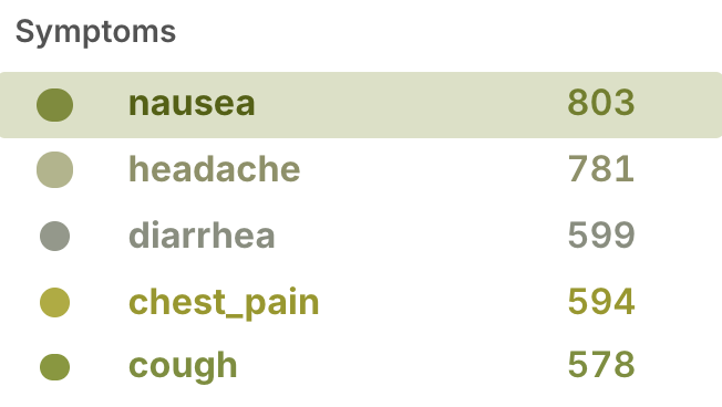
"my-shelf": {
  "kind": "shelf",
  "field": "symptoms"
}
Tiny Donut
Shows proportional relationships of data values. Ideal for fields with a small number of unique values.
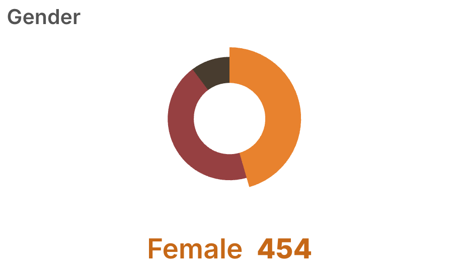
"my-tiny-donut": {
  "kind": "tinydonut",
  "field": "gender"
}
Telescope
Shows distribution of values using color coding. Ideal for fields with a small number of unique values.
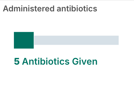
"my-telescope": {
  "field": "antibiotics",
  "kind": "telescopebars",
  "label": "Administered antibiotics"
}
Histogram
Shows distribution of continuous numerical values.
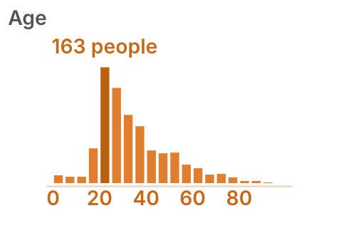
"my-histogram": {
  "field": "age",
  "kind": "histogram"
}
Record table
Displays individual records from data, where the columns are specified fields.
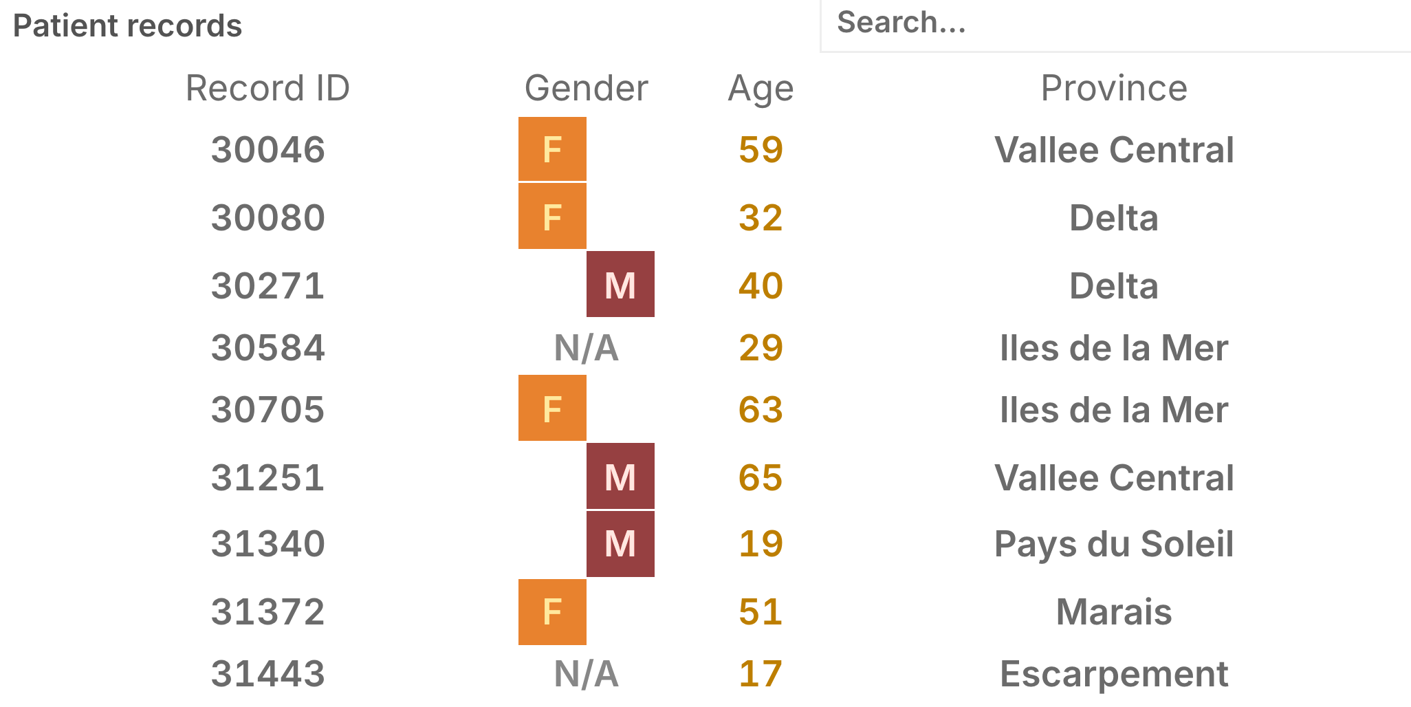
"my-record-table": {
  "kind": "record-table",
  "label": "Patient records",
  "fields": [
      { "field": "record_id", "label": "Record ID"},
      { "field": "gender", "label": "gender" },
      { "field": "age", "label": "age" },
      { "field": "province", "label": "Province" }
  ]
}
Text analysis
Shows counts of common words and phrases, revealing patterns in text-based data such as clinical notes or patient-reported data.
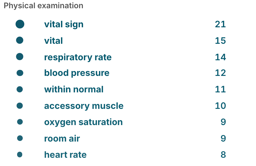
"my-text-analysis": {
  "kind": "text-leaderboard",
  "field": "physical_examination"
}
Phylogenetic Tree
Interactive tree representation of sequencing data.
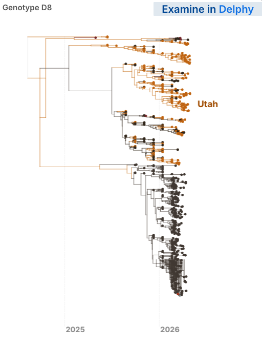
"my-phylo-tree": {
  "kind": "tree",
  "uri": "measles_skygrid.nwk", // name of file containing sequencing data in site/data
  "nwk_delimiter": "|",
  "nwk_id_pos": 0,
  "root_date": "2025-04-20",
  "timeTickInterval": "year",
  // optional: link to view tree in Delphy
  "delphyLink": "https://measles.sentinel.network/delphy/?https://measles.sentinel.network/delphy/measles-2603231721.dphy",
  "color_by": {    // optional: color by values of another data field
    "field": "state"
  }
}
Note: Delphy is a tool for visualizing interactive phylogenetic trees.
Gauge
Displays single value as portion of whole. Ideal for showing percentages.
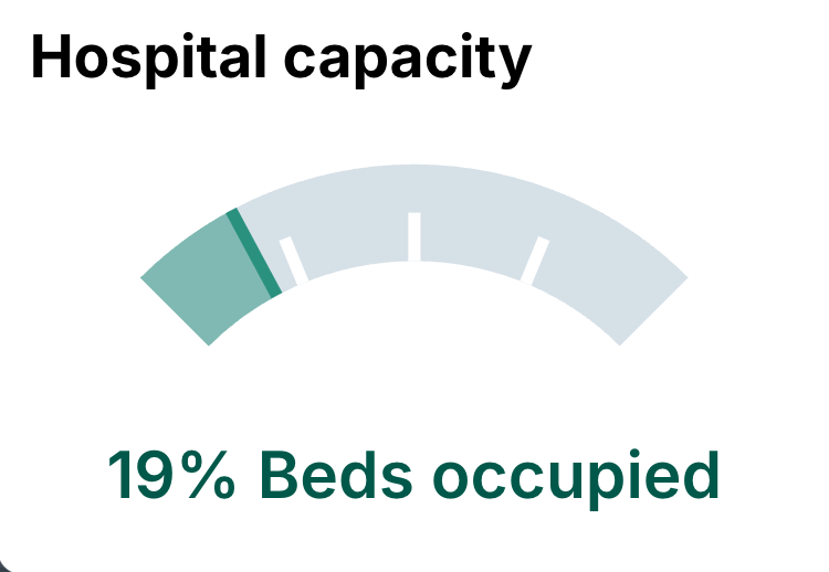
"my-gauge": {
  "kind": "gauge",
  "field": "beds_filled",
  "label": "Hospital capacity",
  "showPercent": true // Optional. If unspecified, raw count is shown.
}